 All about GPD design
 Guidelines
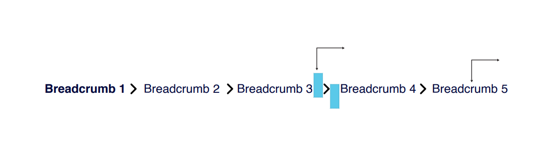
 Patterns
 Data Visualization
 Help
Help
HTML
<div>
<input type="checkbox" class="checkbox" id="checkbox_label">
<label for="checkbox_label" class="checkbox-label">
<span class="checkbox-label-text">Checkbox label</span>
</label>
</div>
CSS
.checkbox {
clip: rect(0,0,0,0);
border: 0;
height: 1px;
left: 0.7rem;
margin: -1px;
overflow: hidden;
padding: 0;
position: absolute;
top: 1.25rem;
visibility: inherit;
white-space: nowrap;
width: 1px;
}
.checkbox-label {
cursor: pointer;
display: flex;
font-size: .875rem;
font-weight: 400;
letter-spacing: .16px;
line-height: 1.28572;
min-height: 1.5rem;
padding-left: 1.25rem;
padding-top: 0.1875rem;
position: relative;
user-select: none;
}
.checkbox-label-text {
padding-left: 0.375rem;
}
.checkbox-label:before {
background-color: transparent;
border: 1px solid #161616;
border-radius: 2px;
content: "";
height: 1rem;
left: 0;
margin: 0.125rem 0.125rem 0.125rem 0.1875rem;
position: absolute;
top: 0.125rem;
width: 1rem;
}
.checkbox-label:after {
background: none;
border-bottom: 1.5px solid #fff;
border-left: 1.5px solid #fff;
content: "";
height: 0.3125rem;
left: 0.4375rem;
margin-top: -0.1875rem;
position: absolute;
top: 0.46875rem;
transform: scale(0) rotate(-45deg);
transform-origin: bottom right;
width: 0.5625rem;
}
.checkbox:checked+.checkbox-label:before{
background-color: #161616;
border: 1px;
}
.checkbox:checked+.checkbox-label:after {
transform: scale(1) rotate(-45deg);
}
.checkbox:disabled+.checkbox-label {
cursor: not-allowed;
}
.checkbox:disabled+.checkbox-label:before {
border-color: hsla(0,0%,9%,.25);
cursor: not-allowed;
}
.checkbox:disabled+.checkbox-label:before{
background-color: hsla(0,0%,9%,.25);
border: 1px;
cursor: not-allowed;
}
.checkbox-visually-hidden {
clip: rect(0,0,0,0);
border: 0;
height: 1px;
margin: -1px;
overflow: hidden;
padding: 0;
position: absolute;
visibility: inherit;
white-space: nowrap;
width: 1px;
}