 All about GPD design
 Guidelines
 Patterns
 Data Visualization
 Help
Help
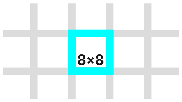
2X Grid
2X Gird :
The 2x Grid is the geometric foundation of all the visual elements from typography to columns, boxes, icons, and illustrations. It provides structure and guidance for all creative decision-making.
The basic unit of 2x Grid geometry is the 8-pixel square mini unit. Multiples of mini units compose the dimensions of columns, rows, boxes, along with their margins and padding. The mini unit adapts to your content while maintaining a consistent visual rhythm.
Columns and Rows
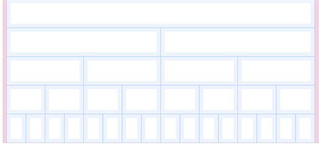
Columns and rows create key lines that are essential for visual rhythm, especially for typography. Construct columns by either dividing a space into a fluid grid, or by tiling fixed boxes in multiples.
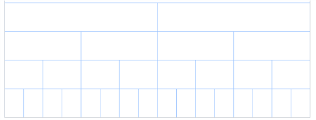
Fluid grid
A fluid grid divides space by twos. This division is immediately evident in the 2x column structure. Within a breakpoint, the column count is constant, and unit size scales with screen size. Choose a column count by starting with one, then divide by two as needed.
Fixed grid
A fixed grid starts with a fixed unit size from the sizing scale, then tiles and wraps as needed, like text. To employ the 2x concept, once you’ve determined the original box size that you want to use, you can multiply it by two and so forth to create a layout.
When tiling fixed boxes, the column count is not known in advance, but a grid emerges visually due to the use of a consistent sizing scale. On breakpoint boundaries, fixed sizing scales match column sizes.
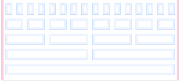
Hybrid grid
Hybrid grids are also frequent in practice, and hybrid boxes have properties of both.
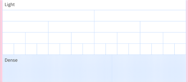
Decision tree
For dense content, use mini units for further alignment and spatial guidance.
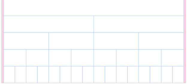
Margins
The margins at the outer edge of the grid are always a fixed size within a breakpoint, even when columns are fluid.
Padding
Padding is always a fixed multiple of mini units: 16 pixels at all standard breakpoints. Always align type to the edge of box padding. Note, some design tools add padding to text boxes by default; check text box padding and remove it if necessary.
Gutters
Grid gutters can be absent as shown above, or present as shown below. The margin around each grid box matches its padding, for a total gutter of 32 pixels. For closely related content, consider a gutter less grid. Apply gutters when content warrants more separation.
Breakpoints
Use this set of standard breakpoints to maintain layout integrity across screen sizes.
| Breakpoint | Value (px/rem) | Columns | Size (%) | Size | Padding | Margin |
| Small | 320 / 20 | 4 | 25% | 80 px | 16 px | 0 |
| Medium | 672 / 42 | 8 | 12.5% | 80 px | 16 px | 16 px |
| Large | 1056 / 66 | 16 | 6.25% | 64 px | 16 px | 16 px |
| X-Large | 1312 / 82 | 16 | 6.25% | 80 px | 16 px | 16 px |
| Max | 1584 / 99 | 16 | 6.25% | 96 px | 16 px | 24 px |